Change the opacity of an image, color correction, or material with a slider in Lens Studio

Letting the user change the opacity (or alpha) of an image is a pretty common question on the Lens Studio forums. Changing the opacity of an image itself isn't too tricky, but knowing how to do it with a slider so the user can control it is a bit trickier. In this tutorial we'll walk through the whole process and end up with a fully reusable script for future projects. You can see an example of this type of effect by clicking here or by scanning the snapcode below.

The user interface
Before we create our script, let's go ahead and get our slider created. We are going to use the extremely handy Lens Studio User Interface (UI) system. Download the zip file, unzip it, and then from inside Lens Studio import the UI_Widgets.lso file. This will add a "UI" folder in the Resources Panel and a "[Place Under Orthographic Camera]" hierarchy of objects in the Objects Panel. We want our slider visible to the user, but we don't want it visible in the captured image/video. Let's set up a new Render Target to make that happen.
- Create a new Render Target in the Resources Panel and name it "UI Render Target" (or something like that)
- Add a new camera to the scene
- Rename it to "UI Camera"
- Create a new "UI" layer and set the camera to only that layer
- Set the camera render target to the UI render target
- Change the camera type to Orthographic
- In the Scene Config Panel, change the Live Target to the UI render target
- Drag the UI widgets to the UI Camera (make sure they are children of the camera)
- Open up the UI widgets and delete everything except the "UI Color Picker"
- Fully expand the UI Color Picker and put everything on the UI layer
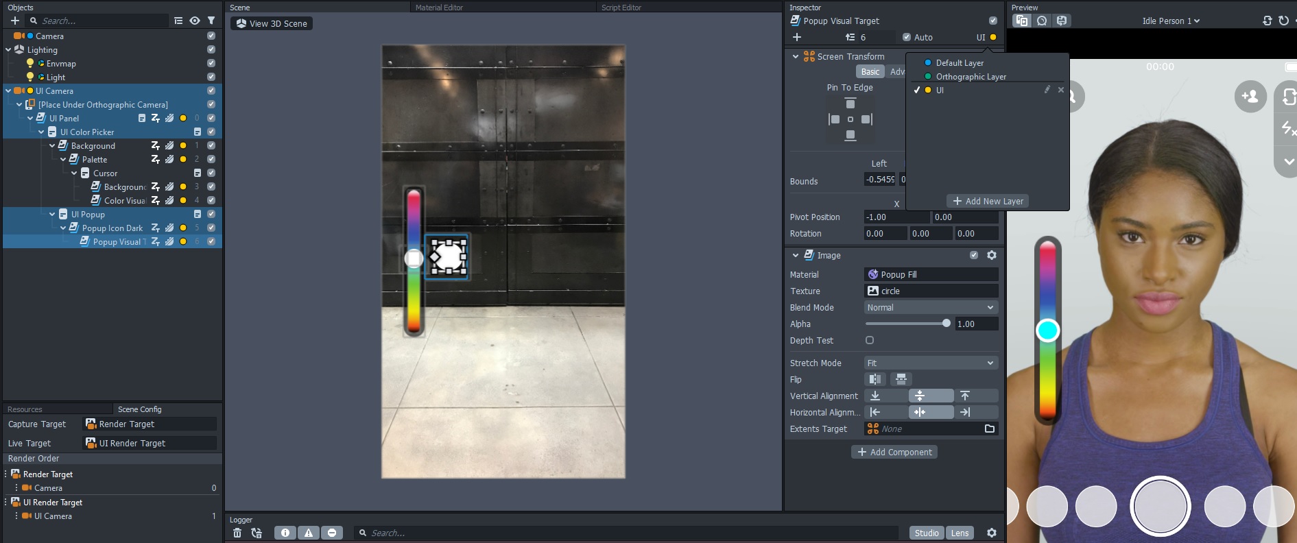
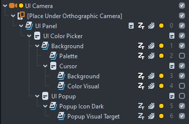
Now that we have our slider visible, it is time to tweak the appearance. We will be using the slider to control opacity, so we don't need the color bar or anything. Disable the UI Popup, Color Visual, and Palette. The cursor will disappear after you disable the Palette, so drag it out from under the Palette and parent it to the Background. You should now have the dark slider background with the cursor (the white circle) still present. You can also load in your own images for the cursor and slider background if you wish.
The gameplan
Now that we have our slider, let's start controlling stuff with it! We want to be able to control the opacity of images, materials, graph materials, and post effects, and ideally we'll just need one script to worry about. Fortunately, that is very doable with the right setup. Let's get started with the base script and then we'll go in and setup each of the different opacity controllers.
The base script
The opacity of an image is controlled differently than the opacity of a material. The basic principles are the same, but the script property we use to access each is different (Component.Image vs Asset.Material). Rather than write a different script for each thing we want to control the opacity of, we are going to have one base script that lets us choose what we want to target. To do this we will be making use of the custom script UI from Snapchat (not to be confused with the UI slider we just created). Go ahead and create a new script, add it to your scene, and then open up the Script Editor.
To start off, we are going to create a dropdown menu so we can choose what entity we are controlling the opacity of. It will be a string input, but we can tell Lens Studio to display a menu of choices rather than have us type in an input.
// @input string entity {"widget":"combobox", "values":[{"label":"Image", "value":"image"}, {"label":"Post Effect", "value":"post"}, {"label":"Material", "value":"mat"}, {"label":"Graph Material", "value":"graph"}]}Our first line of code will be this long line for the entity. The first part @input string entity probably looks pretty normal. The next part might be new though. This is a JSON object that specifies what sort of script UI to show. The "combobox" is essentially a dropdown menu and the "values" are what get displayed. Each item in the list has a "label" which is displayed inside Lens Studio and a "value" which corresponds to what the value of the input is. Add this line to your script, save it, and then you should see the dropdown menu showing up. What's really cool about this is that we can conditionally display other script inputs based on what is chosen in this dropdown.
// @input Component.Image image {"showIf":"entity", "showIfValue":"image"}The above line of code specifies an image component input, but it will only show if "image" is selected in our dropdown. Pretty cool! So for controlling image opacity we only need the one input - the image. Let's go ahead and setup the rest of our inputs.
// -----JS CODE-----
// @input string entity {"widget":"combobox", "values":[{"label":"Image", "value":"image"}, {"label":"Post Effect", "value":"post"}, {"label":"Material", "value":"mat"}, {"label":"Graph Material", "value":"graph"}]}

// @input Component.Image image {"showIf":"entity", "showIfValue":"image"}

// @input Component.PostEffectVisual postEffect {"showIf":"entity", "showIfValue":"post"}

// @input Asset.Material mat {"showIf":"entity", "showIfValue":"mat"}

// @input Asset.Material graphMat {"showIf":"entity", "showIfValue":"graph"}
// @input string property {"showIf":"entity", "showIfValue":"graph"}
// @input float multiplier {"showIf":"entity", "showIfValue":"graph"}

// @input float initialValue = 0.5
// @input Component.ScriptComponent colorPickerScript
Our complete input section is as above. You can see the various values we are letting the user input, including an initialValue and colorPickerScript that pertain to all types of input. This initial value will be what we want the opacity value to start at. For the most part we just need to specify the type of entity (Component.Image, Asset.Material, etc), but for the graph material we have a few more inputs. The "property" will let us specify which graph parameter we want to change (more on that later when we setup a material) along with a "multiplier." Opacity values range from 0-1 so we don't really need that, but it will be helpful to see how that works for adjusting values that lie on a larger scale (0-3 for example). Now that we can specify our inputs, let's connect our slider to our script before we get into actually adjusting opacity values.
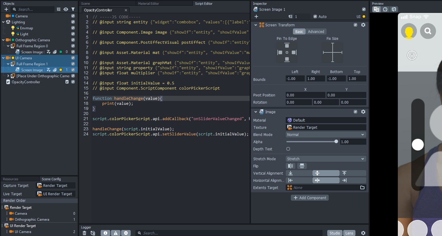
If we refer back to the User Interface page (for the slider), we'll see that the Color Picker let's us assign a callback for when the slider changes as well as set the slider value. Let's add some code to our script to handle that. Add the following lines of code to the script, save it, select the "UI Color Picker.Script" for the colorPickerScript input on our script, and then start moving the slider. You should see the current slider value printed in the logger. Once you see those values, it is time to start adjusting some alpha values!
function handleChange(value) {
  print(value);
}

script.colorPickerScript.api.addCallback("onSliderValueChanged", handleChange);

handleChange(script.initialValue);
script.colorPickerScript.api.setSliderValue(script.initialValue);
Image opacity
Let's start with adjusting image opacity. Select the original camera in the scene and then add a Screen Image. This should create a new orthographic camera as well. If you don't see the screen image in the Preview Panel, don't worry, we'll take care of that. Go to the Scene Config and drag the Orthographic camera under the original camera. This will make sure the new orthographic camera is rendered before our UI cam is. Next, create a new Screen Image for the UI camera and drag it above the slider UI (also set it to the UI layer). For the image texture choose "Render Target." Basically what we are doing is making sure our lens is all rendered out to the Render Target (which is set for the Capture Target) but then so that we can also see it in our live target we are displaying the Render Target as a screen image on the UI camera.
Now that we can see our screen image, let's control the opacity! Inside our handleChange function we are going to add a switch. Our new function should look like this:
function handleChange(value) {
  print(value);
  switch (script.entity) {
    case "image": {
      script.image.mainPass.baseColor = new vec4(1, 1, 1, value);
      break;
    }
    default:
      break;
  }
}
If you aren't familiar with a switch statement, it just takes an input and then based on the value executes a different code block (defined inside each case). If there isn't a block of code for the switch input, it executes whatever is inside the default block. For adjusting image opacity, we take our image, get the mainPass, and then adjust the baseColor. The baseColor is like the tint to the image. If it is white, then we just see the image. Otherwise it'll add a color tint. In our case we don't want to tint the color, but we do want to adjust the alpha value. It is pretty simple, but not necessarily well documented (I had to search the forum to find out how to do this). Now on your script in the scene, choose the "image" option, select the screen image, and then start moving the slider. You should see the image opacity changing!
Post effect strength
We can control the strength of post effects in much the same way. Now, this won't work for all post effects, but it does work for those added from the "Color Correction" menu in the Objects Panel (the LUTs). Add the following snippet of code to the switch statement and give it a try! You'll notice it is basically the same as adjusting image opacity, except we are specifying a post effect for the input rather than an image.
case 'post': {
    script.postEffect.mainPass.baseColor = new vec4(1, 1, 1, value);
    break;
}
Material opacity
We can also control the opacity of materials! Add a material (add a sphere or something to the scene and give it your material). Make sure the material blend mode is set to Normal (it might default to Disabled), add the following code to the switch statement, and then give it a try!
case 'mat': {
    var currColor = script.mat.mainPass.baseColor;
    script.mat.mainPass.baseColor = new vec4(currColor.r, currColor.g, currColor.b, value);
    break;
}
Graph material opacity
Now let's get a little more tricky with a Graph Material. We won't adjust the opacity here. Instead we'll adjust the strength of the Gauss Blur post effect, but the exact same method would be used to adjust an opacity parameter for any material you might create with the material editor. Go ahead and add the Gauss Blur post effect.
case 'graph': {
    script.graphMat.mainPass[script.property] = value * script.multiplier;
    break;
}
This code is going to look a little different. Instead of accessing the baseColor, we are passing in a custom property. If you hover your mouse over the "Blur Factor" slider for the Gauss Blur material, the little tooltip will name it as "blurFactor." This is the value you would set as the "property" input for our opacity script. If you were creating your own custom graph material with an opacity input, you would simply swap out "blurFactor" for whatever your parameter name is. Since our slider only goes from 0-1, the multiplier allows us to access a greater range, such as 0-5 for the Gauss Blur strength.
The final script
Here is our final script to give us ultimate control over opacity! It isn't complicated, mostly a lot of choosing the right inputs and then just setting values. But this script is reusable in any project where you want to give the user control over the opacity of an image, color correction, or material.
// -----JS CODE-----
// @input string entity {"widget":"combobox", "values":[{"label":"Image", "value":"image"}, {"label":"Post Effect", "value":"post"}, {"label":"Material", "value":"mat"}, {"label":"Graph Material", "value":"graph"}]}

// @input Component.Image image {"showIf":"entity", "showIfValue":"image"}

// @input Component.PostEffectVisual postEffect {"showIf":"entity", "showIfValue":"post"}

// @input Asset.Material mat {"showIf":"entity", "showIfValue":"mat"}

// @input Asset.Material graphMat {"showIf":"entity", "showIfValue":"graph"}
// @input string property {"showIf":"entity", "showIfValue":"graph"}
// @input float multiplier {"showIf":"entity", "showIfValue":"graph"}

// @input float initialValue = 0.5
// @input Component.ScriptComponent colorPickerScript

function handleChange(value) {
  print(value);
  switch (script.entity) {
    case "image": {
      script.image.mainPass.baseColor = new vec4(1, 1, 1, value);
      break;
    }
    case "post": {
      script.postEffect.mainPass.baseColor = new vec4(1, 1, 1, value);
      break;
    }
    case "mat": {
      var currColor = script.mat.mainPass.baseColor;
      script.mat.mainPass.baseColor = new vec4(
        currColor.r,
        currColor.g,
        currColor.b,
        value
      );
      break;
    }
    case "graph": {
      script.graphMat.mainPass[script.property] = value * script.multiplier;
      break;
    }
    default:
      break;
  }
}

script.colorPickerScript.api.addCallback("onSliderValueChanged", handleChange);

handleChange(script.initialValue);
script.colorPickerScript.api.setSliderValue(script.initialValue);